The fonts you use greatly affect the user experience and design of your website. Good fonts increase readability and user engagement. That’s why choosing the right font is important. If you are somebody who has to run a website then having a great font is a big priority in order to have a good design.
Table of Contents
The Difference Between A TypeFace and A Font:
A typeface is a collection of design features for letters, other special characters, and the letters’ weight, height, balance, and spacing, the difference between upper and lowercase letters, etc. altogether are that which constitute a typeface.

While Font is a certain style of a typeface family such as Bold, Italic, Regular or light.

Classifications of Typeface:
Serif:

Sans serif:
Sans serif refers to typography designed without serif. “sans” is the French word for “without”. As time progressed modern fonts and letters evolved, and people started moving from primarily Serif to Sans Serif fonts.Slab serif:
Slab serif refers to typography designed close to sans serifs in construction and low stroke contrast. But possessing serifs that match the overall stroke.Monospaced:
 Monospaced refers to typefaces that are designed in a way in which all or most characters take up the same amount of horizontal space. They are also called fixed-pitch, fixed-width, or non-proportional fonts. They are often used in Coding apps or to represent editors.
Script:
The script refers to a genre of typefaces that take inspiration from handwriting and calligraphy. They are formal in their composition.Handwriting:
Handwriting refers to typefaces that are written by the human hand, usually with a pen or pencil.Display:
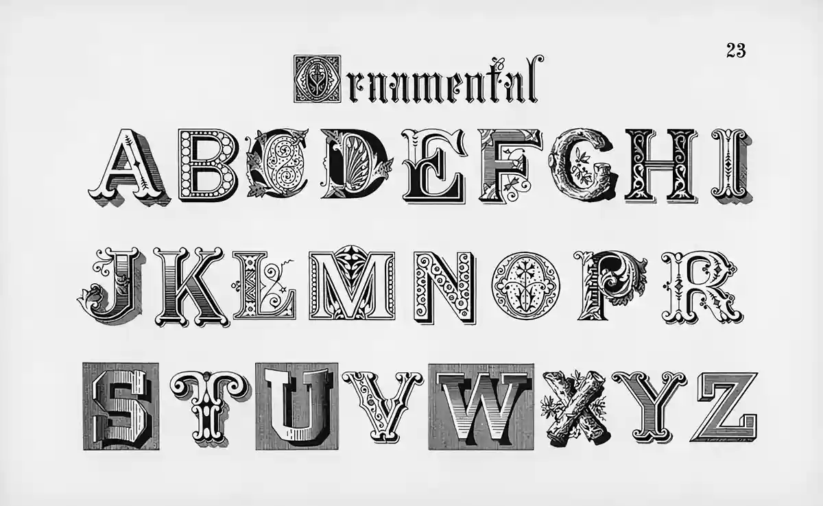
The display is a catch-all term for a loose grouping of decorative typefaces.


What are Google Fonts?
Google Font is a web font service owned by Google. They are typeface fonts that can be used for free. As of January 2024, Google Fonts have 1,474 font families and 282 variable font families.
Why you Should use Google Fonts?
Google Fonts offers thousands of free and open-source fonts for commercial and personal use. They are easy to add to your site, updated automatically and multiple languages are supported.
The Top 50 Google Fonts:
Roboto:

The Roboto font is a neo-grotesque sans-serif typeface family. It’s a default font used for Android and is often the primary font of choice for people looking to maintain familiarity.
Roboto was designed by Christian Robertson, a type designer at Google. The font was created for the Android operating system and has since become one of the most widely used sans serif typefaces on the web. Roboto has a versatile design that makes it suitable for use in a wide range of contexts, from interface design to body text in digital documents. The font supports a wide range of languages and scripts, including Latin, Greek, and Cyrillic.Open Sans:

Open Sans is a humanist sans-serif typeface. It’s often used by many websites for Body copy fonts as it’s legible across multiple weights and sizes.
It is a versatile and accessible sans-serif typeface designed by Steve Matteson. It was designed with a humanist approach, which emphasizes the importance of clear, legible letterforms that are easy to read.
Open Sans contains a wide range of characters, including Latin, Greek, Cyrillic, and Hebrew, making it suitable for use in a variety of contexts and languages. The font has been updated to include a variable font family and its licensing has been simplified and unified under the Open Font License (OFL). This allows Open Sans to be used freely across the web and in various applications.Montserrat:
 Montserrat is a geometric sans-serif typeface. It has risen to prominence in the past few years. It’s the font of preference for modern-day designers and is often seen in posters and whatnot.
The Montserrat typeface is inspired by the traditional typography of Buenos Aires and was designed to rescue the beauty of urban typography from the first half of the 20th century. The font is released under the SIL Open Font License and includes the normal family, Alternates, and Subrayada. The family was redrawn by Jacques Le Bailly and adjusted to make the Regular lighter and better for use in longer texts. The project also includes Cyrillic support and is led by Julieta Ulanovsky, a type designer based in Buenos Aires, Argentina.Lato:
Lato is another great sans-serif typeface that many modern-day bloggers use as a body copy typeface. It was designed by Lukasz Dziedzic a Warsaw-based designer in 2010. It was initially created for a corporate client, but when the client decided to go in a different direction, the Lato family was released under the Open Font License by Lukasz’s foundry, tyPoland, with support from Google.
The typeface aims to balance the need for a “transparent” appearance in body text with unique traits in larger sizes. Lato uses classical proportions for harmony and elegance and has a sleek sans-serif look. The design of Lato reflects the design trends of 2010 and does not follow current trends.Poppins:
Poppins is a geometric sans-serif typeface that supports both the Devanagari and Latin writing systems. It is a new addition to the tradition of geometric sans-serif typefaces. The design of the Latin glyphs is more constructed and rationalist than other typefaces, while the Devanagari design is particularly new and is the first Devanagari typeface with multiple weights in this genre.
Both the Devanagari and Latin designs are based on pure geometry, specifically circles. The letterforms are nearly monolinear with optical corrections applied where necessary to maintain a consistent typographic color. The Devanagari characters are the same height as the Latin ascenders and the Latin capital letters are shorter than the Devanagari characters. The x-height of the Latin letters is set relatively high. Poppins was designed by Ninad Kale for the Devanagari and by Jonny Pinhorn for the Latin script.Oswald:

Oswald is a sans-serif typeface that was reworked from the classic “Alternate Gothic” style. It was designed to be used on digital screens, including desktop computers, laptops, and mobile devices. The initial release of Oswald was in 2011, but it was updated regularly over the years with additional weights, language support, spacing and kerning improvements, and other refinements.
In 2016, the Latin part of the family was updated, and in 2019 it was updated to include a variable font-weight axis. Vernon Adams worked on the typeface until 2014, and Kalapi Gajjar continued the work started by Vernon.dInter:

Inter is a variable font family designed specifically for computer screens with an emphasis on readability. It has a tall x-height to improve the legibility of mixed-case and lower-case text, as well as various OpenType features, such as contextual alternates, a slashed zero to distinguish between “0” and “o”, and tabular numbers. The Inter project is led by Rasmus Andersson, a software maker based in San Francisco.Raleway:
Raleway is a versatile sans-serif typeface family that has been carefully designed to deliver an elegant and refined look. Initially, it was created by Matt McInerney as a single thin-weight font, but later it was expanded into a 9-weight family by Pablo Impallari and Rodrigo Fuenzalida in 2012. The font was further improved by Igino Marini with the addition of iKerned characters. In 2016, Raleway received a thorough review, and an italic version was added to the family.
Raleway is well-suited for display use, with features like the old style and lining numerals, standard and discretionary ligatures, a wide range of diacritical marks, and a stylistic alternate inspired by geometric sans-serif typefaces. Additionally, Raleway has a sister family named Raleway Dots that offers a similar elegant look.
Ubuntu:

The Ubuntu Font Family is a set of open-source, libre fonts developed by Canonical Ltd. and designed by Dalton Maag. The font was created to give Ubuntu a distinct look and feel, with clear readability on both desktop and mobile screens. The family supports multiple languages and is continuously being expanded to include more written languages.
The font files and design files are released under an open license and are encouraged to be modified and improved by the wider Free Software community. Ubuntu and Canonical are trademarks of Canonical Ltd.Nunito:

Nunito has a humanist feel and is designed to be highly legible, even at smaller font sizes. The rounded terminals give the typeface a friendly and approachable appearance, making it well-suited for use in user interfaces, digital products, and branding.
The font includes a wide range of characters, including support for a variety of Latin-based scripts, as well as Greek and Cyrillic. It also includes a range of OpenType features, such as ligatures and alternate characters, making it easy to customize the typography to fit your needs.
Jacques Le Bailly is a type designer based in France and is responsible for the extension of the Nunito font family.
Merriweather:

Merriweather is a serif typeface designed for readability on screens. It features a high x-height, condensed letterforms, mild diagonal stress, strong serifs, and open forms.
Merriweather Sans is a sans-serif version of the font that harmonizes closely with the weights and styles of the Merriweather family. The project is led by Sorkin Type, a type design foundry based in Western Massachusetts, USA.Nunito Sans:

Nunito Sans is a regular non-rounded terminal version of the Nunito font. It’s a well-balanced sans-serif typeface. Nunito Sans provides a more traditional sans-serif look and is also versatile enough for a wide range of uses.Playfair Display:

Playfair is a transitional typeface designed for use in display typography. It takes inspiration from the designs of John Baskerville and Scotch Roman and can be used alongside Georgia for body text. The font family includes a main family, Playfair Display, and a small caps family, Playfair Display SC.
The font files include small caps, common ligatures, and discretionary ligatures, and the family was updated in November 2017 with language support and small improvements. In August 2019, it was converted to a variable font. The project is led by Claus Eggers Sørensen, a type designer based in Amsterdam, Netherlands.Rubik:
The Rubik font family is designed for use on the screen and in digital environments. It is optimized for readability and versatility, making it a suitable choice for a wide range of design projects, from websites and apps to branding and editorial design.
The rounded corners give the design a friendly and approachable feel, while the 5 weights and Roman and Italic styles provide designers with a range of options for creating hierarchy and emphasis. The addition of the monospaced variation, Rubik Mono One, and the redesigned Hebrew and Cyrillic components make this font family a comprehensive and global solution for designers.Noto Sans N’Ko:
Noto Sans is a sans-serif font designed for texts in the Latin, Cyrillic, and Greek scripts. It has multiple weights, widths, and italic styles contains 3,741 glyphs, and supports 2,840 characters from 30 Unicode blocks.
Noto Sans N’Ko is a sans-serif font designed specifically for texts in the African N’Ko script, it contains 184 glyphs and supports 79 characters from 2 Unicode blocks. Both Noto Sans and Noto Sans N’Ko are part of the Noto font family and are developed by Google. Ideally, you should use Noto Sans on your website unless you specifically need the N’Ko to support the African language.Lora:

Lora is a serif typeface designed to be used as body text. It features moderate contrast and brushed curves, creating a modern and memorable appearance.
The typeface has been optimized for both screen and print and is well-suited for use in stories, essays, and other similar applications. The Lora font family was updated in March 2019 to include a variable font version.Kanit:

Kanit font is designed by Matitep Suthiwan and has received recognition from several design organizations. The font is available in several weights and supports multiple scripts including Latin and Thai. The Kanit font family is optimized for screen use and has been hinted with TTFAutohint to ensure maximum readability and legibility.
The design of the font has a mix of Humanist Sans Serif and Capsulated Geometric styles and the strokes have flat angles for better spacing between letters. Special attention was given to certain groups of letters to ensure that they are distinct and legible, making them suitable for various uses, both contemporary and futuristic.Fira Sans:

The Fira font family includes a sans-serif design with low contrast and a tall x-height, which helps to improve legibility on screens. The Fira font family includes 4 weights (Regular, Medium, Bold, and Black) and their corresponding italic styles, providing flexibility and versatility for various design needs.
The monospaced variant of Fira is designed to be used in programming and coding environments, where consistent spacing is crucial. Overall, the Fira font family is designed to be highly legible, functional, and versatile, making it a suitable choice for a wide range of applications.Hind:

It’s a humanist-style typeface designed for use in User Interface design, and it supports both Devanagari and Latin scripts. The font family has five styles and is designed to be legible, with open apertures, monolinear strokes, and clear counter forms between the characters.
The Devanagari and Latin scripts are scaled so that the Devanagari characters fall just below the Latin capital height, ensuring that the text set in both scripts sits nicely alongside each other. Hind is published by Indian Type Foundry and was designed by Manushi Parikh.Quicksand:

Quicksand is a sans-serif font characterized by rounded terminals and created primarily for display use. Its development started in 2008 with Andrew Paglinawan as the lead designer, who utilized geometric shapes as the basis.
Although intended for display, the font has been made legible enough to be used even in small sizes. In 2016, Thomas Jockin joined forces with Andrew to refine the font, and in 2019, Mirko Velimirovic transformed it into a variable font.Mulish:

Mulish is a minimalist sans-serif font suitable for both display and text use. It was first created in 2011 by Vernon Adams and improved until 2014 through hundreds of user feedback. The font was given additional weights, support for more Latin languages, improved spacing and kerning, and received various glyph refinements.
In 2017, Jacques Le Bailly finished the work started by Vernon, who passed away, with the help of Vernon’s wife Allison, who holds the trademark on the font family name. In August 2019, Mulish was updated with a variable font “Weight” axis.Barlow:

Barlow is a Grotesk font family with low contrast and slightly rounded edges.
Inspired by the visual style of California’s public designs, including license plates, highway signs, buses, and trains, Barlow embodies the state’s aesthetic. It comes in Normal, Semi Condensed, and Condensed variations, each with 9 weights in both Roman and Italic styles.
The project is headed by Jeremy Tribby, a San Francisco-based designer.
Inconsolata:

Inconsolata is a monospace font designed by Raph Levien for use in printed code listings and similar applications. Unlike many other “programmer fonts,” which are made primarily for screen use, Inconsolata has a high level of detail for high-resolution rendering.
Inspired by Luc(as) de Groot’s Consolas and TheSansMono, both beautiful monospaced designs, Inconsolata aims to prove that monospace fonts can be appealing. The Regular style was created by Raph Levien in 2006 using Spiro-based tools and FontForge. The Bold style was added in 2012 by Kirill Tkachev and the Cyreal foundry.
As of April 2020, the font family has been upgraded to a variable font family.
Titillium Web:

Titillium was created as a teaching project for the Master of Visual Design Campi Visivi course at the Accademia di Belle Arti di Urbino.
The goal of the project is to create a collective font released under the OFL license. Each academic year, a team of students works on the font, improving it and addressing any issues. Type designers interested in modifying or improving Titillium are welcome to collaborate or create their own variations under the terms of the Open Font License. The project invites graphic designers who use Titillium in their projects to send examples for inclusion in a database of case studies.
Three years after its creation, Titillium continues to evolve, and its future development looks promising.
Heebo:

Heebo is a Hebrew and Latin typeface that expands Christian Roberton’s Roboto Latin to include Hebrew characters. It was designed by Oded Ezer and the font files were perfected by Meir Sadan.
As the primary focus of the family is on Hebrew design, its vertical metrics differ from the original Roboto family. Heebo is auto-hinted, while Roboto is hand-hinted, which may result in better rendering quality on older Windows machines for Roboto.
In May 2020, the Heebo family was updated to a variable font family. Oded Ezer, a type designer based in Tel Aviv, Israel, leads the Heebo project.
IBM Plex Sans:

IBM Plex is a typeface family that blends mankind and machines. It was designed by Mike Abbink of IBM BX&D in collaboration with Bold Monday, a Dutch-type foundry. The design captures IBM’s history and spirit with a neutral yet friendly Grotesque style. It includes Sans, Sans Condensed, Mono, Serif, and other styles for multiple languages and offers excellent legibility for print, web, and mobile interfaces.
The three designs work independently or together for various design needs, with the Sans serving as a contemporary font, the Serif for storytelling, and the Mono for code snippets. The italics add extra expressiveness to the design.DM Sans:

DM Sans is a low-contrast geometric sans serif typeface designed for use in smaller text sizes. It was commissioned by Google and designed by Colophon Foundry, a UK-based, award-winning type foundry that specializes in high-quality retail and custom typefaces for both analog and digital media.
DM Sans supports the Latin Extended character set, making it suitable for typesetting in Western European languages. The design is based on the Latin portion of ITF Poppins by Jonny Pinhorn.Nanum Gothic:

Nanum Gothic is a sans-serif typeface designed to meet the needs of contemporary Korean language typesetting, while also supporting Latin. It is characterized by its warm touch and optimized for screen use, with expert hinting.
The typeface is part of the Nanum font set, which was created by Sandoll Communications and Fontrix, and published by Naver, a South Korean online search platform.Karla:

Karla was designed by Jonathan Pinhorn of ITF (International TypeFounders) and is a modern and versatile font that can be used for a variety of applications, including websites, text and display typography, and print materials. The design is characterized by its low contrast and geometric forms, which give it a neutral and legible appearance.
The inclusion of support for the Tamil script, in addition to the Latin script, makes Karla a unique and valuable resource for multilingual typography.Arimo:

Arimo is a sans-serif typeface that was created to address the needs of developers who require width-compatible fonts for document portability across different platforms. The font is designed by Steve Matteson and is metrically compatible with Arial.
Arimo features improved on-screen readability and supports the pan-European WGL character set. It was updated in May 2013 with better hinting and is available under the Apache 2.0 license.Cabin:

Cabin is a humanistic sans-serif font inspired by the work of Edward Johnston and Eric Gill, with a touch of modernism. It blends traditional elements with modern proportions, optical adjustments, and some geometric sans features to create a unique style.
The Cabin font family includes two variable fonts – a Roman style and a true italic – with a weight range from regular to bold and a width range from normal to condensed. The font features a nearly monolinear stroke contrast, with slight thinning on the top and bottom curves. The counters of the letters “b,” “g,” “p,” and “q” have rounded shapes, and all letterforms have been optically adjusted.
Cabin offers extensive language support, including full Latin coverage for Vietnamese, as well as support for Western, Central, and South/Eastern European languages.
Oxygen:

The Oxygen font family was developed as part of the KDE Project, a free desktop environment for the GNU+Linux operating system. It was optimized for the FreeType font rendering system and is suitable for use in all graphical user interfaces, desktops, and devices.
This web font version of Oxygen is designed for widespread use on the internet by web browsers on desktop computers, laptops, and mobile devices, and is available for free use.
Overpass:
Overpass is a free, open-source font designed by Delve Fonts. It is based on the “Highway Gothic” letterforms from the U.S. Federal Highway Administration’s Standard Alphabets for Traffic Control Devices. The letterforms were modified to provide optimal legibility in both small on-screen sizes and larger display sizes, particularly in lighter weights.
Assistant:

Assistant is a type family that includes both Hebrew and Latin scripts. It features a contemporary sans-serif design for Hebrew characters and includes 6 upright styles, ranging from Extra Light to Black.
The Hebrew part of the type family was designed by Ben Nathan and was created to match the Latin script in Source Sans Pro, which was designed by Paul Hunt at Adobe Type.
The Assistant project is headed by Ben Nathan, a type designer based in Tel Aviv, Israel.
Tajawal:
Tajawal is a unique Arabic and Latin sans-serif typeface family that comes in 7 weights. Designed by Boutros™, it combines modern geometric design with traditional calligraphy elements in the Arabic script.
Its fluid geometry makes it suitable for use in print and web applications and can be easily paired with other Latin typefaces.Play:

Play is a minimalist sans-serif typeface designed by Jonas Hecksher, who was serving as Type Director at Playtype Type Foundry at the time of its creation. All letters in Play are based on the letter “O,” which is both square and circular.
The font features large, open counters, a substantial x-height in lowercase letters, and a professional yet friendly appearance. These attributes result in high legibility and readability.Exo:
Exo is a modern geometric sans-serif font that conveys a futuristic and technologically advanced feeling while maintaining an elegant design. This versatile font includes 9 weights, each with a corresponding italic version, making it suitable for use as a display font as well as for smaller to intermediate-sized text.
In December 2013, Exo was redrawn and rereleased as Exo 2, which boasts a more organic look and improved performance in small text and long passages.
In April 2020, the Exo family was updated to a variable font format.
Cinzel:
Cinzel is a font that takes inspiration from first-century Roman inscriptions and is based on classical proportions. However, it’s not a straightforward revival. Cinzel encompasses the ancient history of the Latin alphabet while also incorporating a modern touch.
Faustina:
Faustina is a typeface from the Omnibus-Type Press Series, created by Alfonso Garcia for use in print and online editorial typography such as books, newspapers, and magazines. In September 2019, the Faustina font family was converted into a variable font format.
Philosopher:
Philosopher is a font that was started in 2008 and takes inspiration from Agfa Rotis and ITC Binary. This font is versatile and can be used for logos, headlines, and body text. The initial version of Philosopher was deliberately released with errors as the designer wanted to inspire designers to work with fonts instead of using them passively.
Over time, the errors were corrected, and now the font has been used by millions of people worldwide. In June 2011, a four-style family was released, and in September 2011, the full Latin and Cyrillic family was hinted.Gelasio:
Gelasio is a transitional typeface designed to be metrics-compatible with Georgia in its regular, bold, italic, and bold italic weights. Inspired by a French Transitional typeface and with influences from the Romain Du Roi typeface, Gelasio features a mix of formality, rigour, and friendliness, with rounded terminals and occasional flourishes in the italic styles.
The typeface was updated in June 2022 with major language support improvements.Sofia Sans Condensed:
Sofia Sans is a modern and versatile typeface that was originally designed for the capital city of Bulgaria. It is a comprehensive type system that offers coverage for Latin, Greek, and Cyrillic scripts and comes in four widths, including Normal, SemiCondensed, Condensed, and ExtraCondensed.
With its inspiration from early-twentieth-century technical sans serifs typefaces and its focus on confident letterforms, pronounced vertical impetus, and tense curves, Sofia Sans also has humanistic details and soft round corners, making it ideal for both print and digital work. Additionally, Sofia Sans is a feature-rich OpenType family with a large character set, including small caps, several figure styles, arrows, and numerals in circles, among others.Noto Sans Devanagari:
Noto Sans Devanagari is a typeface designed by Google as part of the Noto font project. It is a sans-serif font specifically designed for the Devanagari script used in India and Nepal.
The font contains 954 individual glyphs and supports 272 characters from various Unicode blocks including Devanagari, Vedic Extensions, Devanagari Extended, Basic Latin, General Punctuation, and Common Indic Number Forms. The font also includes 17 OpenType features for enhanced typography and readability.Actor:
Actor is a digital sans-serif typeface created as part of a diploma thesis project at the Aachen University of Applied Sciences.
It features strong x-height and old-style figures, with unique forms for 6, 9, 8, and 7. The Actor font was created to explore the role of typography as an information carrier.Epilogue:

Epilogue is a sans serif typeface designed by Tyler Finck, a type designer based in Ithaca, New York. It is a variable font with a weight axis, offering 9 weights in both upright and italic styles.
It has wide language support and is suitable for a range of typographic applications.Glegoo:
Glegoo is a modern slab serif font designed for both text and headline use. It has a precise balance of shapes, counterforms, and strokes, making it easy to read even in small sizes.
The font is slightly condensed and has a large x-height, short ascenders and descenders, and large counter forms. The bold style and Devanagari subset were added in an update in August 2014 and the family was hinted with ttfautohint for improved performance.Overlock:
Overlock is a typeface designed to simulate the Overlock sewing technique, characterized by its warm and rounded glyph shapes that give a unique feeling to the text. It is ideal for titles and short texts in magazine-style layouts and works best at larger sizes.
It is available in three weights (Regular, Bold, and Black) with true italics and also includes two sets of numbers and small caps as a separate Overlock SC family. The typeface was selected by the Letras Latinas Biennal in 2006.Lustria:
Lustria has a friendly and approachable feel due to its rounded serifs and organic shapes. It features fine details that give it character and make it suitable for use in various design projects, especially those requiring a display typeface.
The typeface comes in a variety of weights and styles to provide versatility in its use.Ovo:
Ovo is a medium-contrast serif font that has been inspired by a set of hand-lettered capital letters seen in a 1930s lettering guide. The design has a classical feel with a soft serif treatment but also has a subtle casual feeling that is reflected in the lowercase letters and whimsical numbers.
Ovo works best at medium to large sizes due to its old-style variable letter widths and subtle details.Suranna:
Suranna is a Telugu font designed for use in news publications. It has a unique shape due to its heavy weight at the bottom of letters and includes many conjunct glyphs. It is named after the Telugu poet from the court of King Krishnadevaraya and was developed by Purushoth Kumar Guttula in 2013 and made available under the SIL Open Font License v1.1.
The Latin script was designed by Cyreal and is based on the Prata font. The project was led by Appaji Ambarisha Darbha, a type designer based in Hyderabad, India.


The above top fifty list is in no way a definitive guide but it shows our own personal preferences. There are a few more general pointers that we would like to give to aspiring Bloggers and Webmasters.
General Pointers
- Serif Typefaces work great for body copy font along with big and bold Sans Serif Typefaces.
- It’s a good idea to set a decent font size on your website so that everything is readable. At Least 17px or upwards for Body Copy and 24px or upwards for Headings would work great.
- If you are going for a modern look then avoid Serif Typefaces.
- Similarly, if you are going for a classical time-tested look then avoid Sans Serif Typefaces.
- You can read our Typography guide here for more info.
In case you have any doubts or which to add anything more then feel free to reach out to us in the comments below!
So guys, if you liked this post and wish to receive more tech stuff delivered daily, don’t forget to subscribe to the Inspire2Rise newsletter to obtain more timely tech news, updates, and more!

